A great website is alpha and omega when interacting with current and new members. It works as an integrated platform that should attract new members to your gym but also retain your current members.
Through busy times it's easy to neglect your website, but as it often serves as the first impression of your business, you need to keep it relevant and ensure great conversion rates.
For that purpose, you must use time and effort on perfecting your website. To set you off at a great start, we have gathered 10 best practices to how you can build a powerful gym website that will drive sales and engagement.
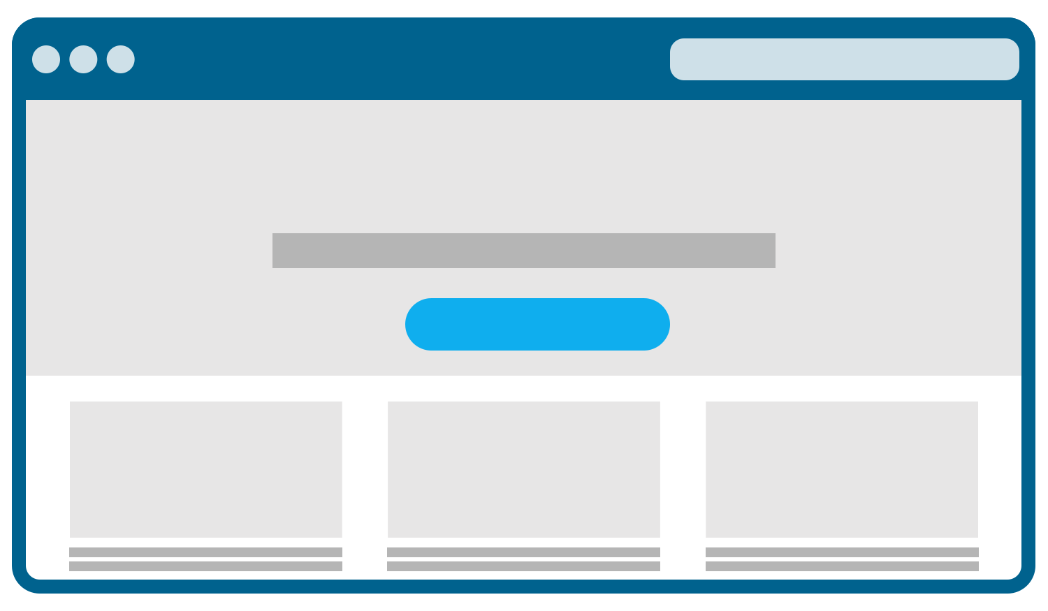
1. Front pages are for first impressions – make it count
Your front page will most likely be the first place potential new members interact with your business on your website. It’s crucial that they get a great first impression of your business, as it will form their initial opinion of you.
Make sure it’s clear from the very top of your front page what kind of business you run and what you offer. Focus on the values and benefits you can offer members when they join your gym.
It’s all about making it clear from the beginning what members can expect from you and about talking to their needs. That way you keep their attention and encourage them to learn more about your business – or even sign up right away.
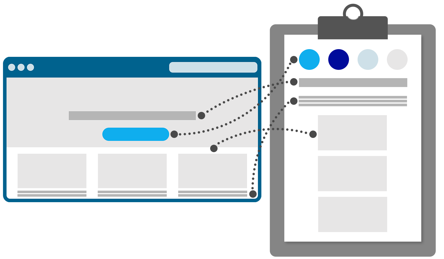
2. Keep a clear and professional brand DNA throughout your website
Your brand DNA is how you present your business. It’s all about choosing the right colours, fonts, tone of voice, visual elements etc. that together create an intriguing look and feel that speaks to your audience.
It can be an advantage to make a brand guide with guidelines for your brand DNA. That way everyone throughout your business is aware of how to showcase your business as a brand.
The brand guide is especially an advantage if you are using external resources for social media promotion, video editing, web configuration etc. and other collaborations.
In your brand guide you can:
- Showcase primary and secondary colours
- Describe fonts and rules for when to use them for different headers and text sections
- Clarify which font sizes to use for different purposes
- Illustrate your various logo versions (for instance a dark and a light version)
- Display visual elements or icons
- Define your tone of voice and grammar rules
When you have a clear brand DNA throughout your website, you create recognisability. It gives the impression that your website is professional and well-organised – making it more convenient for visitors to browse through.
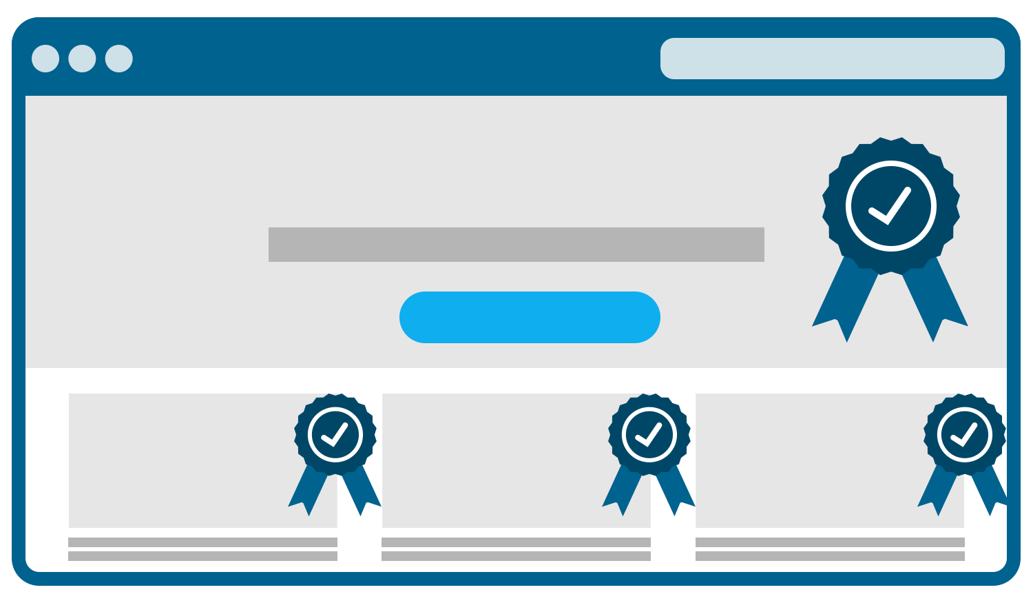
3. Make your visualisations stand out
Great images are a key factor when visitors browse through your website. They can attract attention but also trigger emotions.
Thus, the quality of your images is crucial. Low-quality, blurry or pixelated images will leave a bad impression and make your business look less professional. To avoid that, you need to prioritise great images.
There are several options:
- Hire a professional photographer
- Buy access to licensed images
- Shoot photos yourself – but only if you have the experience and equipment that can secure high-quality images
Images can’t stand alone. You need text to support the message in your images. The proper balance between images and text will create a smooth user experience that makes it easy for the visitor to explore your website.
So, remember to have a harmonised balance between your visual and textual communication.
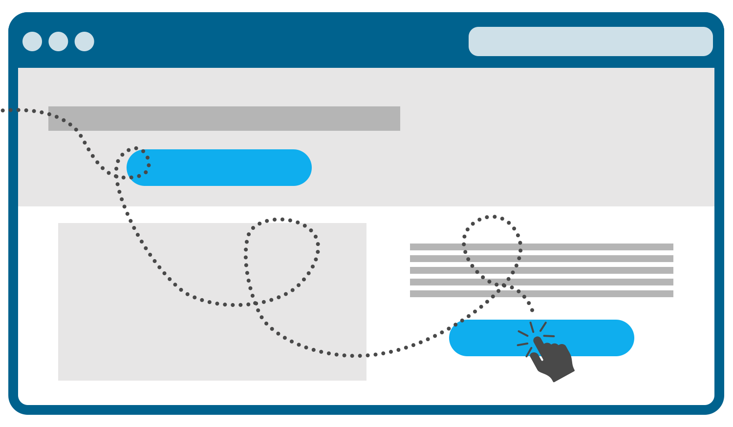
4. Induce an intuitive buyer journey
Your website has to be intuitive and user-friendly. Otherwise, your visitors will leave your website pretty fast.
Fortunately, there are several ways you can help your visitors make the right actions and help them along the way on their buying journey.
CTAs – or Call To Actions – are one the most important elements of your website. They will help your visitors make the right actions at the right time. CTAs are mostly represented as buttons or links.
Buttons or links could include actions like:
- Read more
- Add to cart
- Book class
- Sign up
- Get in contact
- View locations
- Confirm purchase
However, they can also be descriptive actions without linking to anything. For instance, “Call us to learn more”, “Visit our facility to get a tour” etc.
All of your landing pages – including your front page – should include CTAs, so your visitors are guided through the buying process and redirected to the right places – depending on what they need.
Another way to make your website intuitive is with a navigation menu at the top of your website. A menu makes it much easier for your visitors to go straight to the page or information they are looking for.
For instance, if they want to book a class, they can via the menu navigate directly to the class booking page. This will decrease the time your visitor has to spend before accessing the right content - creating a better user experience.
5. Show the benefits of all your memberships
Chances are that you offer multiple types of memberships.
Examples of memberships include:
- Standard membership
- Premium membership
- Student membership
- Senior membership
- Outside of peak hours membership
- Combi membership
- Punch cards
- And the list goes on
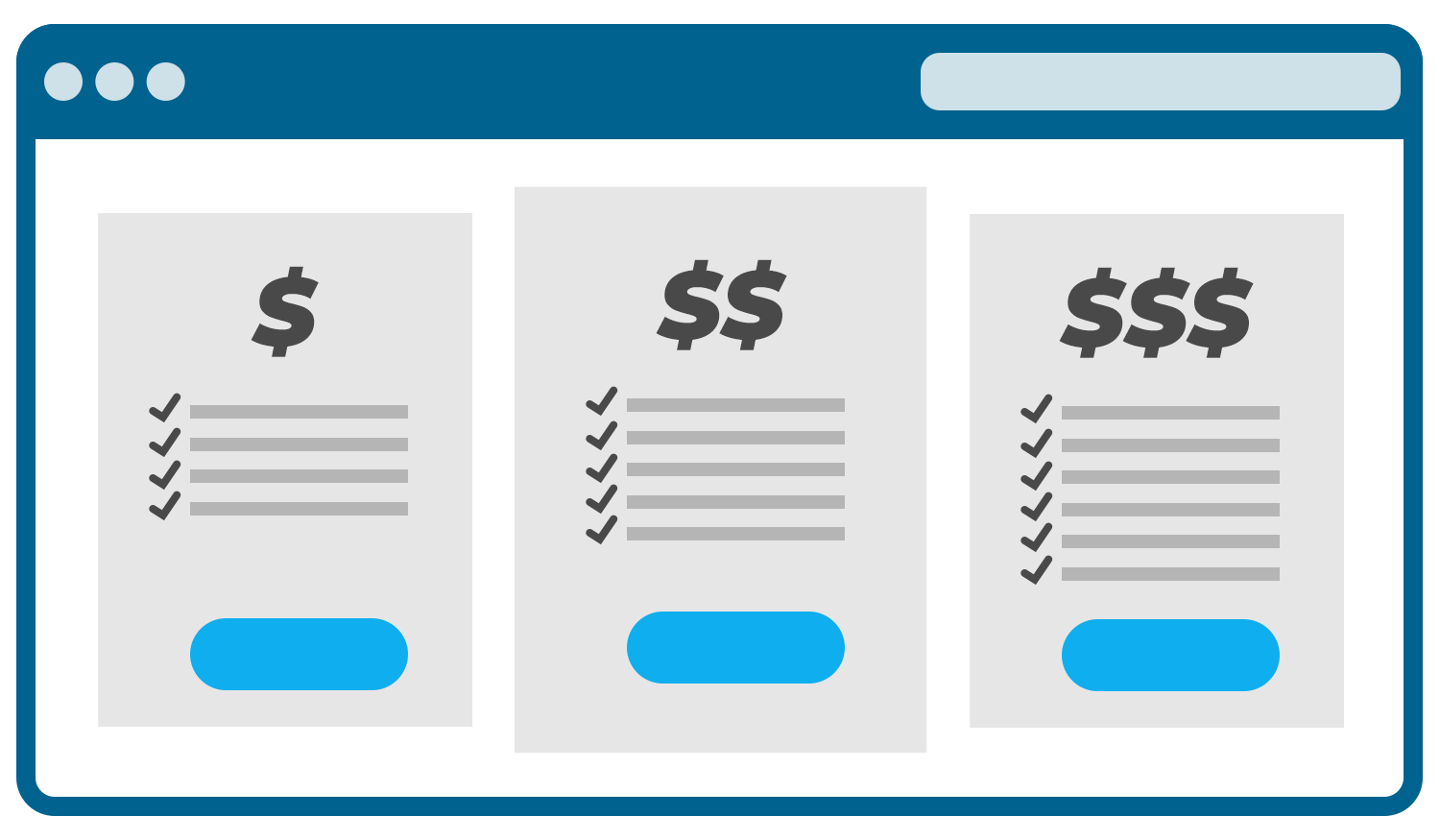
As soon as you offer more than one membership, you need to make it very clear what the differences are between your selection of memberships. Otherwise, you are making it hard for your potential new members to choose the right membership that suits their needs.
It’s a great advantage if you make a landing page that showcases and describes the differences between your memberships.
Describe all the benefits and what is included in each of them. Also, display the price for each membership. It makes it easier for visitors to assess what they get for their money.
6. Showcase all your classes in a clear overview
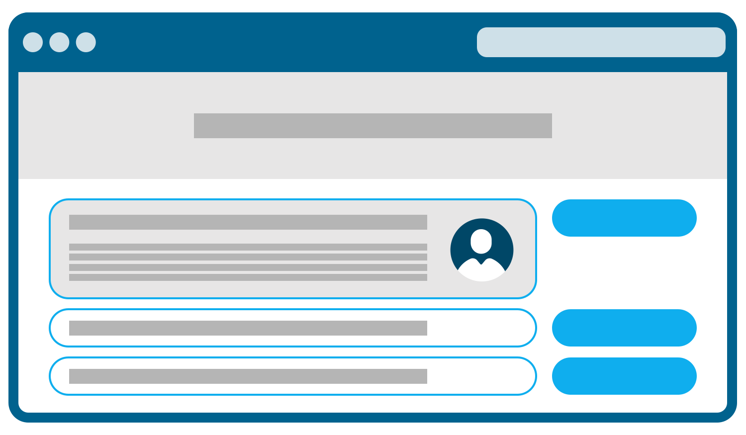
If you offer classes, your website is a great place to manage bookings. Make an intuitive landing page where the selection of your classes is displayed, so both new and current members can get an overview of what you offer.
It can be an advantage to keep the overview simple – e.g., including the names of the various classes – but then giving the option to click on each class to learn more about what the class entails, the instructor etc.
Class names and descriptions are one thing. You also have to make it easy to book a spot in a class. Use clear CTAs to encourage members to book classes.
OBS: Make sure your backend system supports the class booking feature. For instance, specify the number of spots available for each class, and set up waiting list rules, so the real-time booking options are shown on your class booking page.
7. Display your full selection of products and services
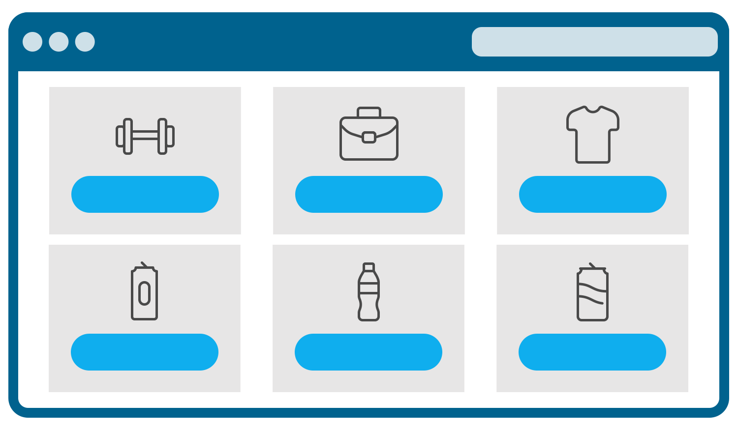
Do you sell products or services beyond your memberships – for instance, at the reception in your facility? In that case, your website can be a great place to promote your different offerings as well.
You can set up a webshop that makes it easy for your members to buy items when needed – either to be shipped to their address or to pick them up at your facility.
If you have a lot of products and/or services, it can be an advantage to divide them into categories to make it easier for your members to browse through your selection.
Categories could include:
- Beverages
- Protein supplements
- Exercise equipment
- Clothing
- Treatments
- Personal training sessions
- Merchandise
A good set-up webshop will boost your sales, as you expand your sales channels to be online as well. So, make sure that it is easy to navigate, add products to the cart and complete the purchase.
8. Make sure your website is responsive
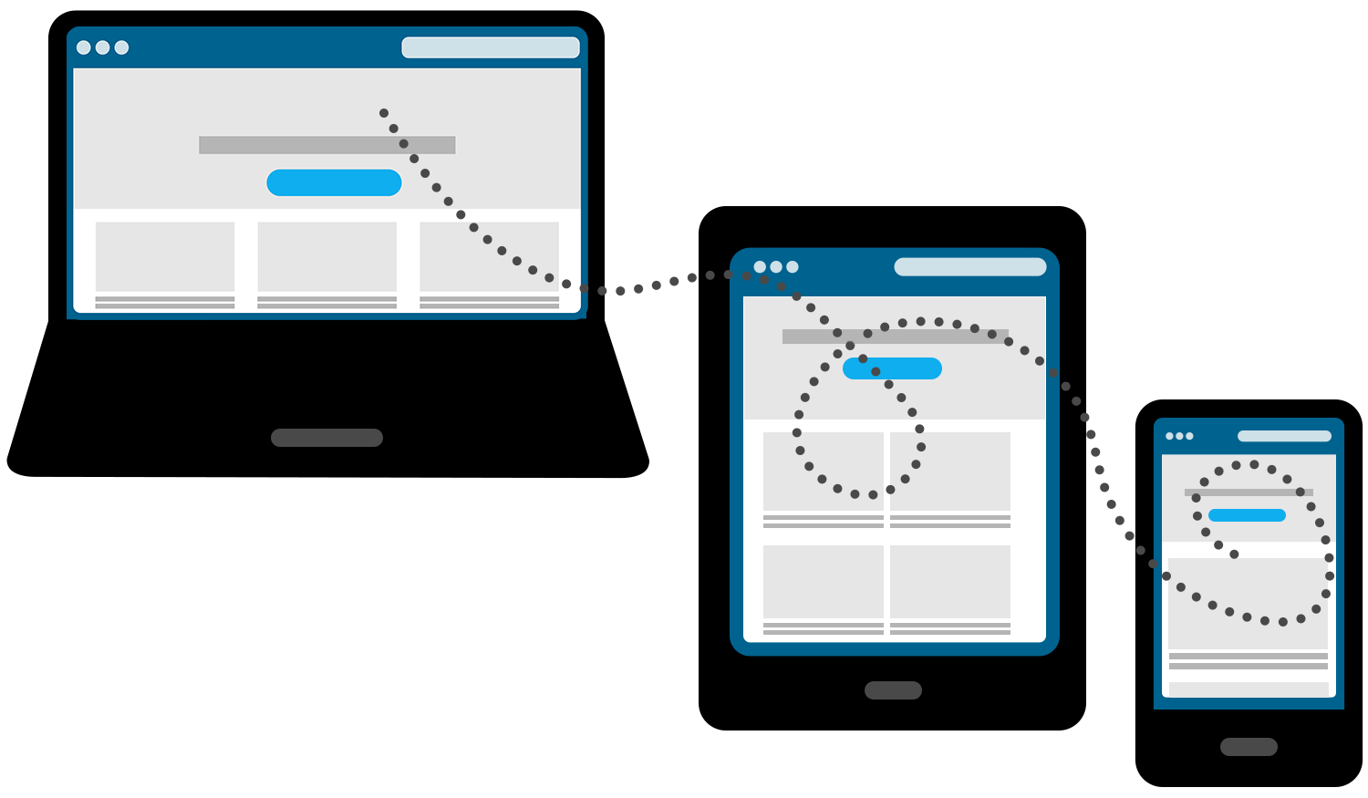
When designing your website, you must tailor it to be displayed in the best possible way regardless of visiting your website via desktop, mobile or tablet.
This is also called a responsive design, as you set up a design that will adapt to the device it is displayed on. If you do not have a responsive design, the worst case is that the elements on your website will be shown off completely wrong – which will lead to high exit rates, as visitors most likely won’t stay long.
So, make it easy for your members and potential new members to interact with your website regardless of which device they are using.
9. Promote special offers or events
A website can be a great place to promote your special offers or if you are hosting certain events. To attract attention to your offers, you can use pop-ups, slide-ins or banners to get your message out there for your website visitors to act upon.
It’s important to stress that it’s all about finding the right balance. Using too many pop-ups, slide-ins or banners can be seen as too intrusive. Make sure you only include the most important offers that you want to highlight.
When handled with care and thoughtfulness, pop-ups, slide-ins and banners can be a highly efficient way to drive sales, sign-ups or whatever you are promoting.
10. Make membership management a walk in the park
Your website should work as more than a sales machine. It should also serve as a platform that can help retain your members. For instance, it should be easy for your members to get an overview of their membership.
A member overview could include:
- Membership type
- Invoices
- Training statistics
- Class bookings
- Purchase history
Make it convenient for your members to access all the information they need straight through your website just by logging in. It can save your receptionist and your members a lot of time, as they will be able to access most of the information they need online.
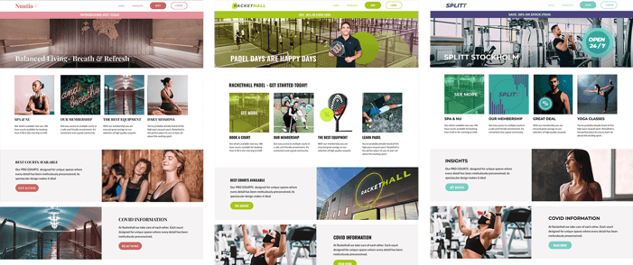
Do you want to easily set up and manage your own website?
Check out our Mobility web solution that allows you to create a powerful website that drives sales and engagement.

